
What to Wear for Family Photos
Everything you need to dress your whānau for a session that actually looks like you: colour, comfort and a few honest do's and don'ts.
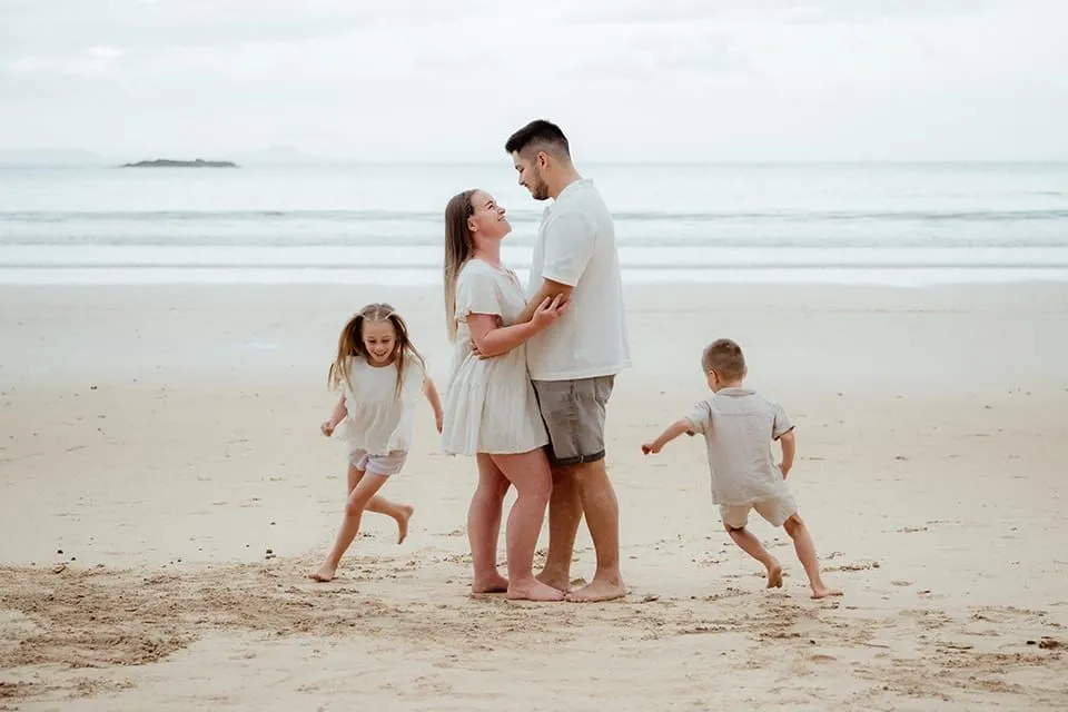
First things first: breathe.
If "but what on earth do we wear?" has already set off a small fire in the family group chat? Welcome, you're exactly where you should be. It's the most common wobble I hear, and a completely normal one.
The whole point of a lifestyle session is that it looks and feels like you. So the number-one rule, the one everything else hangs off, is that comfortable beats perfect every single time. Skim the headlines, steal the palettes, ignore anything that isn't you. I'll help with the rest on the day.
The basics.
Four habits that do most of the heavy lifting, before we even get to colour.
Wear the comfy thing.
There's a pull to buy something new and sparkly. Totally allowed, if that's genuinely your jam. But the reliable route is tried and true: something that hugs you in the good places and lets you breathe in the rest. When you're at ease, it shows in your shoulders, your hands, the way you lean into each other. That ease is the photograph.
Yes
Skip
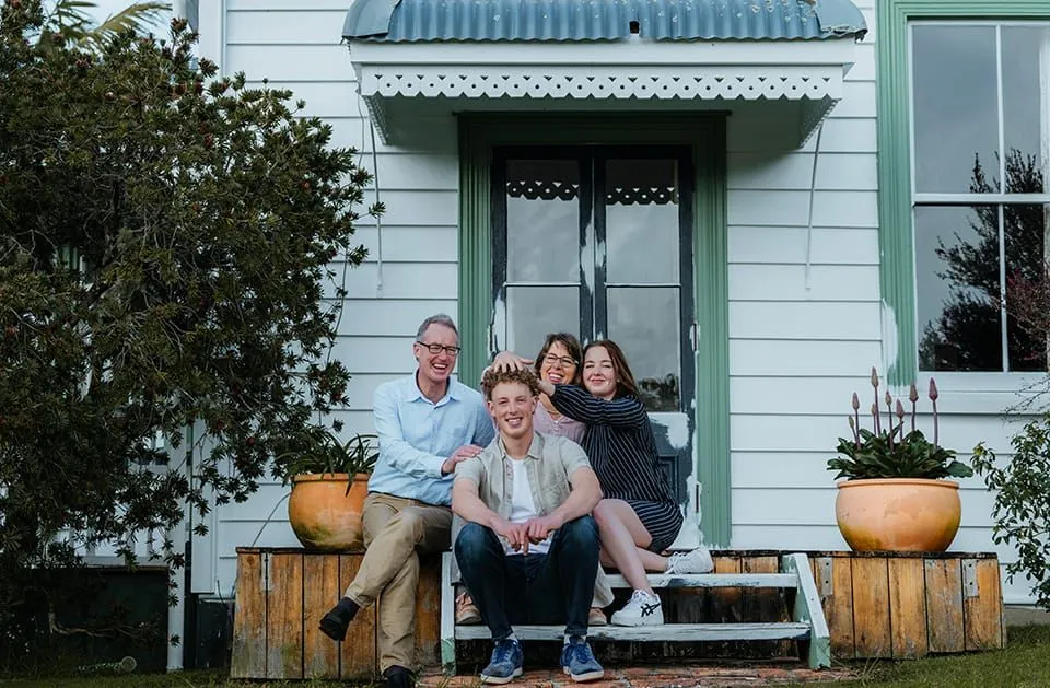
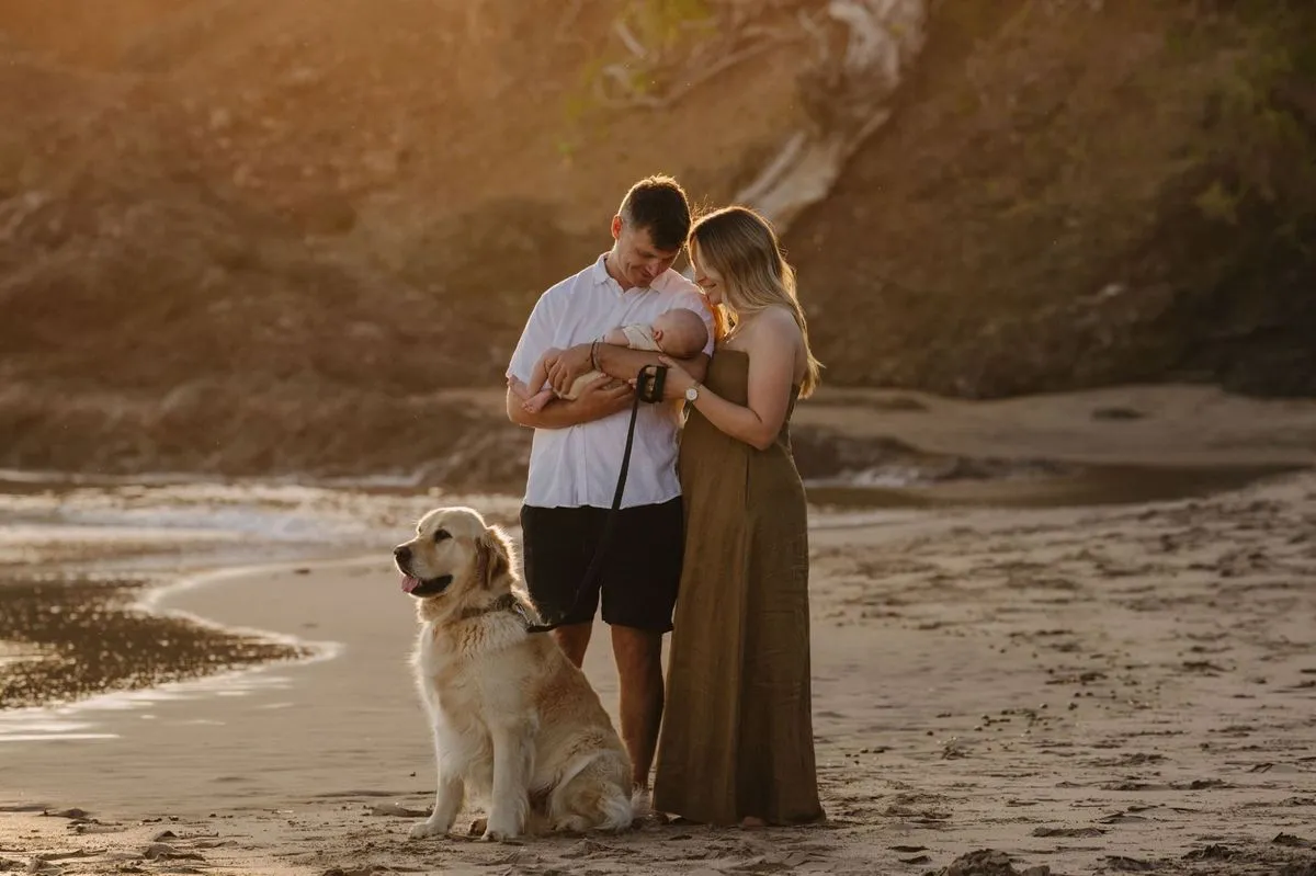
Dress for the place & season.
A ballgown in the lounge reads 'off to the ball', and a sundress in a Northland southerly reads 'someone fetch a blanket'. Plan around the conditions where we're shooting, so aim for warm enough, cool enough, feet that don't hurt, and looking like you belong in the landscape. At-home session? Slip into your comfiest comfies and let the morning be the morning.
Maybe don't wear head-to-toe black on a stinking hot day. Heat, dark fabric and a wriggling toddler is a combination nobody enjoys.
Bring two or three outfits.
Gather a small handful of outfits you genuinely feel great in, and we'll play with combinations on the day. I'm not photocopying a trend. I'm after the you-est version of you, and a couple of options gives us room to find it. They also let me make sure everyone's threads sit well together and against the surroundings.
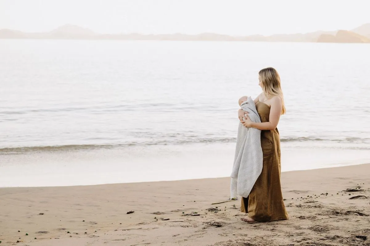
Above all, lead with personality.
If your kid only feels like themselves in gumboots and a dinosaur costume, the dinosaur is invited. Jeans-and-a-tee family? Brilliant. Want to glam it right up? Say no more. I want your shoot to look like nobody else's, because no other family is yours.
04
Texture & movement.
Photographs love fabric that does something, like cloth that catches a breeze, glows when light comes through it, and adds cosy texture up close. Natural fibres are your friends, so linen, cotton, wool, soft knits, denim and cord. Ease off on stiff, structured pieces and crisp formal collars. They read a touch formal and need straightening every frame.
Loves the lens
Linen, cotton, wool
Flowy skirts & dresses
Chunky knits, denim, cord
Less so
Stiff, structured fabric
Crisp formal collars
Anything that won't move
now for the fun part
Let's talk colour.
Aim for softer, grounded tones like neutrals, earthy shades and the odd warm metallic. They flatter almost any Northland backdrop and look gorgeous printed on a wall for years.
I'm not sending you into a beige world of inoffensive oatmeal. Softer doesn't mean boring, it means the grown-up cousin of a colour. Pure primaries are striking, but they can shout louder than the people wearing them, and you're the subject, not the shirt.
Here's the family rule of four. Pick a palette of roughly four colours, let everyone pull from it, and give one person the feature colour, the pop. Dress everyone else in the supporting tones around it. Instant harmony, zero matchy-matchy.
remember year-8 art class?
The colour wheel, in action.
Across the wheel sit complementary colours, opposites that make each other pop, like mustard against blue or rust against teal. Reach for these when you want energy and contrast.
Side by side sit analogous colours, neighbours that blend into a calm, easy harmony, like all the greens of the bush or all the blues of the sea. Lovely when you want soft and soothing.
You don't need to memorise any of it. Just know the two moves exist, and pick the feeling you're after.
the most important colour rule
Complement, don't match.
Here's the trap most families fall into: everyone in the identical colour. Match too hard and your outfits blend into one large, friendly blob, and the viewer can't tell where Dad ends and the teenager begins.
The fix is variety within a palette. Mix tones, textures and a little light-and-dark so each person stands on their own while still belonging to the group. Everything should look good together without looking the same.
for the rebels
Intentional matching can absolutely work: coordinated soft-white linen on the beach, say. The trick is that it's a choice, not an accident. If you're going matchy, own it.
done the thinking for you
Eight palettes, ready to wear.
Pick one as your starting point, give the feature colour to a single person, and pull everyone else's outfits from the supporting tones.
how to use a palette
Nobody needs to wear all five. Treat it as a paint box, two or three tones per person, spread the lightest and darkest across the group, and you're done. Send me a screenshot of your picks and I'll give you a thumbs up before the day.
a worked example
Build your family's outfits.
A family of four at the beach, the exact thinking start to finish. Copy it with any palette and any group size.
1
Pick a palette.
Coastal Linen: pale, beachy, hard to get wrong.
2
Choose your feature.
One person wears the pop. Here, Mum in dusty blue.
3
Dress the supports.
Everyone else pulls from the soft tones: oat, chalk, driftwood.
4
Add texture and a layer.
A chunky knit, a denim jacket, a linen shirt left untucked.
5
Check it against the place.
Pale tones on pale sand: soft, timeless, all eyes on faces.
for the locals
Colours by Northland location.
A head start on palettes that suit the spots I shoot most, from the Whangārei Heads down to Mangawhai and up to the Bay of Islands. Not rules, just a nudge in the right direction.
a bit more help
Seasons and situations.
Quick steers for the moments that need a little extra thought.
Summer and golden hour
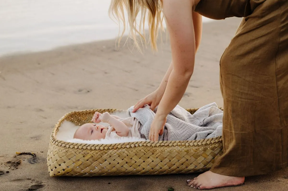
Light linens and breathable layers, a brimmed hat and something you don't mind getting sandy. Late-day light loves warm neutrals and soft pastels.
Autumn and winter
Lean into texture and depth, so knits, wool, denim and layers you can peel off. Rust, mustard, plum, forest and slate all suit the softer, moodier light.
Newborn and maternity
Soft, fitted and simple wins. Flowing fabrics and dresses photograph beautifully, and quiet colours keep the focus on the bump or the baby.
Extended families and big groups
Agree one palette in the group chat first, then let each little family pull their own tones from it. It's the easiest way to keep a big crowd looking pulled together.
Teens, tweens and toddlers
Give them a say. A bit of their own style keeps them comfortable and smiling, which matters far more than a perfect outfit. Pick your battles.
Hair, skin and the little extras
Tidy nails, hair worn down for movement, a shiny watch left at home and make-up kept natural. Small things, but they quietly lift every frame.
the last 10%
The finer details.
Small calls that quietly make or break a frame.
05
Patterns & prints
The larger and louder the print, the harder it works against you. Subtle wins, so small floral, fine stripe or soft flannel. One pattern per person, max.
06
Layer up
Layers add depth and prep you for whatever Northland weather does. They double your looks, too. Jacket on, jacket off.
Denim jacket
Cardigan
Knit
Beanie
07
Logos & slogans
Big logos pull focus and give a sportswear giant free advertising on your wall art. Small, tasteful and genuinely you? Bring it. The test: your story, or theirs?
08
Accessories
Hats, sunnies, a favourite necklace. Great for personality, kept small. One warning, though, a shiny watch face steals the eye in close cuddles. Sentimental? Keep it. Otherwise, bench it.
09
Shoes
Match the outfit and the ground. Comfortable, context-right footwear wins: barefoot on the beach, boots in the bush, clean sneakers anywhere.
10
Props & finishing touches
The best props don't shout 'PROP', so the dog, a blanket, bikes, a ukulele. And keep nails tidy, hair down for movement, watch off. Let the faces lead.
stick it on the fridge
The cheat sheet.
If you read nothing else, read this. Tick them off the night before.
Comfort first.
Worn-in things you feel like yourself in.
Dress for the place & season.
Warm enough, cool enough, feet that don't hurt.
Bring two or three options.
We'll choose together on the day.
Soft, earthy colours
over bright primaries. They last on a wall.
Pick a palette of about four.
One feature colour, the rest supporting.
Complement, don't match.
Give everyone their own tone.
Natural fibres & movement.
Linen, cotton, wool, things that catch the breeze.
Go easy on big patterns & logos.
One small print per person, max.
Layers in the bag.
Jacket, knit, hat for extra looks and warmth.
Subtle nails, hair down, watch off.
Let the faces lead.
the quick answers
Outfit FAQ.
The questions I get asked most about dressing the family for a shoot.
What should you not wear for family photos?
Skip big logos and slogans, neon brights and pure primary colours, busy large-scale patterns, and brand-new outfits you haven't worn in. They pull the eye away from your faces. Soft, grounded colours and comfortable, worn-in clothes always photograph better.
What colours are best for family photos?
Softer, earthy tones like sage, oat, denim blue, rust, clay, mushroom and warm neutrals. Pick a palette of about four, give one person a feature colour and dress everyone else in the supporting tones. These shades flatter most Northland backdrops and still look good on a wall years later.
Should our family outfits match?
Coordinate, don't match. Matching everyone in the identical colour blends you into one block. Instead, pull different tones and textures from one palette so each person stands out while still belonging to the group.
What should we wear for a beach family session in Northland?
Light, airy tones work beautifully on our pale sand, think oat, chalk, soft blue, driftwood and warm neutrals. Bring layers for the coastal breeze, and go barefoot or wear something you don't mind getting sandy. Save the head-to-toe black for another day.
What should we wear for winter family photos in NZ?
Lean into cosy texture and depth, so chunky knits, wool, denim and layers you can add or remove. Deeper, richer tones like plum, forest, mustard and slate suit the moodier winter light, and a hat and jacket in the bag never hurt.
How many outfits should we bring?
Two or three per person is plenty. It gives us options to mix and match on the day and to make sure everyone works together and against the setting, without turning it into a fashion parade.
What should kids wear for family photos?
Whatever lets them be themselves and move freely. Comfy, familiar clothes in your palette beat stiff, fussy outfits every time. If your little one only feels right in gumboots or a favourite dress, bring it. Happy kids make the best photos.
Can we bring our dog?
Absolutely, dogs are family. Just let me know ahead so we can plan for it, and bring a lead and someone to help wrangle them when they're not in the frame.
still stuck? that's what I'm here for
Send me a photo of your picks.
Honestly, lay it on the bed, snap it, send it through. I'd far rather help you get it right now than have you lie awake over it. We're collaborating on telling your family's story, and the wardrobe is the easy part once you know the moves.
book a session.webp)

.webp)
.webp)